This is the finished component. Copy both files, keep the SVG in public, and change the three constants to tune the cloth.
import type { CSSProperties } from "react"

const COLUMNS = 24
const BILLOW = 0.8
const STAGGER = 50

export function WavingFlag() {
  const firstDelay = -COLUMNS * STAGGER

  return (
    <span
      className="waving-flag"
      style={{ "--columns": COLUMNS } as CSSProperties}
      role="img"
      aria-label="Flag of India"
    >
      {Array.from({ length: COLUMNS }, (_, index) => (
        <span
          key={index}
          className="waving-flag__column"
          style={{
            "--billow": `${index * BILLOW}px`,
            animationDelay: `${firstDelay + index * STAGGER}ms`,
          } as CSSProperties}
        >
          <img
            src="/india-flag.svg"
            alt=""
            className="waving-flag__slice"
            style={{ left: `${-index * 100}%` }}
          />
        </span>
      ))}
    </span>
  )
}.waving-flag { display: inline-flex; width: 192px; height: 128px; }
.waving-flag__column { position: relative; flex: 1 0 0; overflow: hidden; }
.waving-flag__slice {
position: absolute;
top: 0;
height: 100%;
width: calc(var(--columns) * 100%);
max-width: none;
}
.waving-flag__column {
animation: wave 500ms ease-in-out infinite alternate backwards;
}
@keyframes wave {
from { transform: translateY(var(--billow)); }
to { transform: translateY(calc(var(--billow) * -1)); }
}The component has no runtime dependency. Use any rectangular image; the technique is not specific to a flag.
How it works
This technique is inspired by Josh Comeau’s animated pride flags. The Ashoka Chakra means a gradient is not enough here, so every column shows a different slice of the same SVG. Think of the finished flag as one image viewed through a row of narrow windows: the image never bends, but moving those windows by different amounts creates the illusion that the surface does.
01 — Start with one image
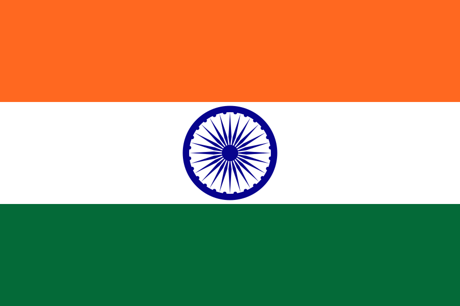
Begin with the untouched image at the final display size. This establishes the flag’s aspect ratio and gives us a reference for judging whether later slicing introduces gaps, stretching, or alignment errors.
At this stage there is only one DOM image and no animation. The meaningful alt text stays here; once the image is duplicated into decorative slices, those copies use empty alternative text so a screen reader does not announce the same flag dozens of times.
<img
  src="/india-flag.svg"
  alt="Flag of India"
  className="h-32 w-48"
/>
02 — Cut it into columns
The outer flag becomes an inline-flex row containing equal-width columns. Each column is a narrow viewport with overflow: hidden, but it contains a complete copy of the same image.
The image inside every viewport is columns × 100% of that column’s width. That makes each copy exactly as wide as the complete flag. Moving copy number index left by index × 100% lines up the correct vertical strip inside its viewport: column zero reveals the first strip, column one reveals the second, and so on. Side by side, those windows reconstruct the original image without visibly duplicating it.
<span className="waving-flag" style={{ "--columns": columns }}>
  {Array.from({ length: columns }, (_, index) => (
    <span key={index} className="waving-flag__column">
      <img
        src="/india-flag.svg"
        alt=""
        className="waving-flag__slice"
        style={{ left: `${-index * 100}%` }}
      />
    </span>
  ))}
</span>
03 — Oscillate every slice
Now each column receives the same alternating keyframe. It moves from a positive vertical offset to the matching negative offset, so the motion reverses smoothly instead of jumping back to its starting position.
Only transform changes, which keeps the animation inexpensive and avoids reflowing the surrounding layout. In this preview every column still uses the same distance and starts at the same time. The entire flag therefore moves together like a rigid trampoline; that deliberately exposes the two ingredients still missing—phase and variable amplitude.
.waving-flag__column {
  animation: wave 500ms ease-in-out infinite alternate backwards;
}

@keyframes wave {
  from { transform: translateY(var(--billow)); }
  to { transform: translateY(calc(var(--billow) * -1)); }
}
04 — Stagger the timing
Convert the column index into a phase offset by delaying each slice slightly more than the previous one. Adjacent columns are now at different points in the same animation cycle, turning synchronized vertical movement into a wave that travels horizontally across the flag.
The first delay is negative by one complete sequence of stagger values. Negative delays do not postpone the animation; they ask the browser to begin as if that much time has already elapsed. The flag therefore appears with a fully formed wave on its first frame instead of slowly building from the pole.
const firstDelay = -columns * stagger

style={{
  animationDelay: `${firstDelay + index * stagger}ms`,
}}
05 — Increase the billow
Real cloth is constrained at the pole and freer toward the outside edge. Give every column its own --billow value by multiplying its zero-based index by a small per-column amount. The first slice receives 0px, while each following slice travels a little farther than the one before it.
This creates a simple linear amplitude envelope: with 24 columns and a billow value of 0.8, the final slice moves about 18.4px in either direction. The stagger controls when a slice moves; billow controls how far it moves. Keeping those responsibilities separate makes the motion easy to tune.
style={{
  "--billow": `${index * billow}px`,
  animationDelay: `${firstDelay + index * stagger}ms`,
}}
The playground below exposes the three values that define the effect. Columns control visual resolution, stagger controls the phase difference between neighboring slices, and billow controls how quickly movement increases toward the free edge. The image source and wave keyframe can remain unchanged while those three values adapt the technique to a different flag or surface.
Playground
Break the wave on purpose. It is only three numbers.